Feedback & Suggestion (March Update) [QOL] (Quality Of Life)
Key Mapping (Re Binding of Keys)
-
Weapon switch dedicated bind.
The option to bind Weapon switching, switch up, switch down, changes weapons, a very basic feature, very needed!
-
Certain keys are missing text or icons. [QOL]
Binding mouse keys such as side keys of the mouse (Back & Forward), will work but not be recognized and stay nameless.
Suggestion: Add actual PC key & mouse mapping icons that encompass the whole spectrum of keys for both mice & keyboards. The game is already using a “limited” number of icons for the mouse.
E.g: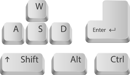
-
Allow the mapping of the Scroll Wheel! [QOL]
Please!
-
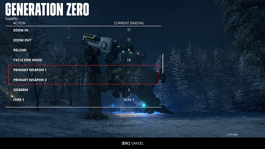
Prioritize user input when mapping keys! [QOL]
Allow re-binding of keys when they are already in use, simply replacing the existing binds with the new user input after a warning message! Highlight unmapped actions with a red bar if actions are allowed to be cleared of binds due to the change.
-
Add “AIM DOWN SIGHT < TOGGLE >” [QOL]
“Sprint” has this option, some people prefer to toggle aim instead of hold to aim.
UI (USER INTERFACE)
-
Mouse navigation option. [QOL]
With the new Inventory layout, it would be much appreciated if we could navigate with the mouse Left & Right keys.
I.e: We are already used to navigating our OS (Operative System) on PC, by, Left click to highlight, double Left click to enter and you can add a Right-click to back out, for ease of navigation!
This would speed up navigation without having to reach across and combine Mouse & Keyboard to simply get around in the UI. While some aspects of mouse navigation are present, [DROP ITEM] [ATTACHMENTS] [ASSIGN TO SLOT] you still need to mouse away from the item in question, this might seem trivial to some but there is a better and quicker way with the click navigation suggested. Right now the Right Mouse key is not even used for anything. -
Radial menu Ammo select! [QOL]
Introduse a Radial Menu to select ammo types for weapons when a key (add an option to key mapping) is held. A Radial Menu is already used in the game for Emotes!
-
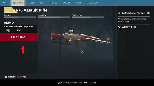
Add a red button to clear! [QOL]
E.g:
Suggestion: Adding a dedicated & styled clear button “clears”, no pun intended, any confusion. Having the Clear Slot function in the same fashion as the Item placeholder that you are clearing is not ideal. -
Loading of Icons in inventory while scrolling.
From always present (Grid Layout) to List Layout and Scrolling, the action of finding the items you want to equip is now delayed exponentially and with the Icons loading, that delay is even greater, however slight the loading is, the eyes still need to adjust and find what we’re looking for.
Suggestion: We should have the option to switch from List view to Grid view, even if scrolling would still occur in Grid view, the items present on any given glance are far greater then the single line setup. -
Emote preview [QOL]
Selected Emotes on the list should start a preview before adding them to the Radial Menu. It is fairly cumbersome, having to equip each one to view them as there are more Emotes then slots to equip them in.
Suggestion: Equip one dance move in a slot in your Radial Menu and if you hover the mouse over that slot, even more, dance moves get displayed above it, it arcs out, with a mouse click to triggers it.
Gameplay
-
Allow 4+ player Co-op! [QOL+++]
This is so important, as we have several friends who we want to play with, it might cause some technical challenges but please consider it seriously!
Some of my friends didn’t buy the game because they wouldn’t be able to play with me as I had already 2 other friends I play with!
If the difficulty is more of a concern, scale it even more! -
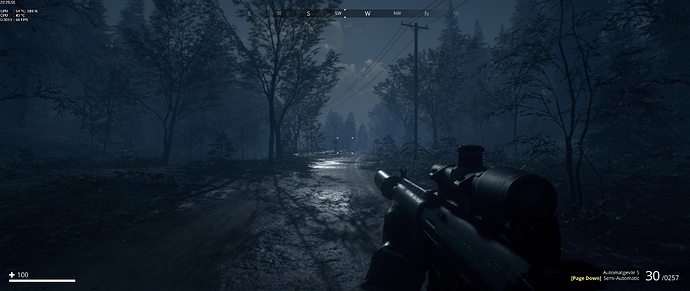
Add Player icons to be visible on the Compass. [QOL]
-
Add a Flair gun.
Sometimes it’s not enough to just throw a flair, especially if Skill points arent yet spent in improving that throw, a Flair gun would be an excellent idea to signal friends your location, with the signal flair to slowly descend. (Or just do the Player icons on Compass approach but why not both?!)
-
Aggressive Harvesters (Should in fact be called Tanks) [QOL]
From Turtles to Ninja Turtles! Harvesters are so helpless and weak with no significant threat factor.
Suggestion: They need to shoot that heavy tank gun barrel thingy, that’s stuck on the top of their frame if it even is a gun, and they need to fire them, long-range!
Their rocket pods should be for medium-range defense while having several machine guns all over them.
These machines currently are a waste of metal, it seems unlikely these things would get built if a teenager with an AI-76 can take it down in 6 seconds single-handedly!
EDIT: I was not fully aware of what the purpose of the Harvesters were, as they have never been seen using their drills, it makes sense now, however, someone mentioned that they rely on their escorts for protection, which most of the time isn’t even a thing, they just roam solo, which is why I didn’t have the right knowledge about them, having only gotten the game one weak ago now. So disregard some of the Tank & Harvester points that are incorrect.
-
Tanks (Should in fact be called Harvesters) [QOL]
While Tanks are the toughest to take down, I surveyed one with at least 20 components on them, therefore seemed like such a breeze downing one considering the results of the Tech Vision, take out its guns and it’s almost neutralized. Taking out its fuel source still keeps them moving, which is weird.
So basically, Tanks, for what they are are still too easy, even on Guerilla Diff.
Suggestion: Rebuild Tanks to have a systematic component failure approach, where you can’t just attack its core or guns, you need to first do this then that and so on, which would bring teamwork and the Binoculars into more of a role!
For solos, there should be things that are out of their reach unless skilled enough.
But with that increase in difficulty to the point of players actually wanting to avoid them, the loot table needs to be far greater too when investing the time and supplies to challenge one! -
Bunker illumination. [QOL]
Turnring the power on in a bunker, the bunker should be well illuminated. If the atmosphere of the game is in concern here, it shouldn’t be!
Most Bunkers will act as a Safehouse thus it should make you feel safe and protected in which, illumination plays a big role in.
I think the light sources, in general, need to be improved, in homes too the light is right there but it’s too faint to illuminate the environment properly. -
Bunker & Underground location Maps. [QOL]
All Bunkers should have a map you can glance at while being underground. Some are huge and disorienting. Or better navigational instructions in facilities, signs, color coordination, etc.
-
Too much loot.
Can’t believe I’m saying this, but there is too much loot of all kinds in all places! Need ammo? it’s all over the place! Instead of, in select few locations such as Police cars, soldier corpses, Bunkers, Enemies, etc.
Sweden does not have this much ammo lying around all over the place XD
Suggestion: The loot table needs to have some common sense! Ammo where ammo is usually found, crafting material where crafting materials are usually found, etc. -
Suppressor dimensions. [QOL]
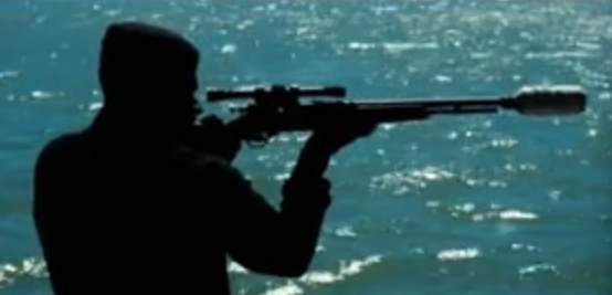
Or as the game calls them “Silencers” have out of wack proportions. “Usually” they should be much thicker then the barrel of the gun they are equipped on. This is only the case with the Sidearms, where the suppressor is thicker, all other guns have very thin suppressors, visually it is irritating. Please thicken them!
EDIT: I hear the game used to have thick suppressors, but got slimed down due to player complaints? Because they were covering up Iron sights on some weapons? Come on now?! That’s just a fact when using suppressors especially on 80s weapons, what players need to do is compensate with their aiming instead of forcing a fact distortion! Correct this pleas!
- Picatinny Rails and Scopes / Sights [QOL]
E.g: The AI-76 has no rails to mount a scope on, the current solution is to add a flat black strip (really out of place) on top so that it looks like the sights are attached to something.
The AK type weapons use a specific mounting apparatus that attaches to the side of the weapon and offers a Picatinny rail over the top cover, which is rocking under fire btw, throwing off your Zeroed scope, so please model and have them on guns that didn’t have pic. rails in the 80s.
End of Feedback & Suggestions Post #1
*** EDIT ***
-
Players shoving.
In multiplayer, the degree of pushing players away is too high, we should be able to nudge one another but not push each other out of the looting UI, down a hallway 20m.
-
Overweight notification on Map [QOL]
It has happened so many times now that I’m overweight in a firefight, I have my Field Radio down, and I don’t get the Fast Travel option, at first I thought this is a new bug before I figured out that I might be overweight thus I can’t fast travel which is why it won’t pop up.
Suggestion: A simple red scale icon would help a lot in these situations, notifying that you are in fact overweight. -
Scopes & Sights lack Rarity grading. [QOL]
Since the March update, any kind of Scopes or Sights lack the rarity grading colors, making it really annoying to pick a better attachment or save good ones from broken low quality bad ones.
-
Recycling Attachments and Weapons [QOL]
Under no circumstance should you be able to recycle equipped items, weapons nor attachments!
-
Storage Box
Our Storage Box does not display the attachments on weapons stored in it, the icons are all grayed out.
-
Riding dirty [QOL]
The Bicycles need a narrower turn radius, they need a stamina bar to force your way up hills as long as your stamina can maintain the boos!
Suggestion: Add early releases of “Mountain bikes” manufactured around the early 80s, with better handling, Mopeds or Scooters would be appreciated too, and the crém de la crém would be Dirt Bikes at higher levels. Regardless of whether they’ve alert anything and everything around you! -
MEDIC! [QOL]
The Peremedic Respons Packs need to be the top healing item, they are cumbersome to use as they are stationary, have a delay between healing, are also limited to 3 uses. These 3 cons should come with 1 pro, full healing in 1 use or at least 70%!
Healing skill does not seem to effect its output. A Simple First Aid Kit heals more with invested Skills than the “PRP” maybe even without Skills. -
EMP devices [QOL]
They are way smaller when deployed then the icon and especially holding it your hands are! This results in you not being able to use it properly in foliage / forest areas as they become un-spottable in the grass. They need to be bigger when deployed.
-
Vehicle Dimensions [QOL]
All cars are too low to the ground, Truck height is fine, Jet height is fine, but the cars are way too low, even when crouched it feels like I’m 6 to 7 feet tall (2m+)
*** EDIT ***
- Level cap & Skills [QOL]
Since we have a level cap. and we’re not notified that we can’t unlock all the skills in the 4 trees, it would only be right if we could respec our skill points, having unlocked and invested points in beginner skills might not work out in endgame scenarios. We strongly request and recommend a Skill respec feature.
Suggestion: Add a fourth player to multiplayer, rework the 4 skill costs to correlate with the level cap, each player in the party may pick a tree to master and roll with that. Unless they want to respec for solo play into another tree. Or just raise the level cap with DLC releases.
