Generation Zero's control system needs to be changed in some points!

Dear Devs,

I left this idea pack on Steam forums too about how controls should be changed for a smoother gameplay experience. And because i think it very important, i signed up here, to leave here too! :slight_smile:
I hope my suggestions will reach You, and will consider it seriously - because the game can be much more better with these changes:

  1. Weapon attachments are detached when weapon placed to storage box.

When i set my weapons’ attachments i’d like them to remain intact until i myself don’t disassemble them. Because if the attachments are detached, there are risks. For example:

A. When i take the weapon again, maybe i don’t remember exactly what attachments were set at last use - but most often i’d like to use the stored weapon again as before i stored it.

B. The homelessly wandering attachments can be easily recycled by mistake.

  1. Equipment hotkeys forget their set if the equipment is out - so it has to be set again.

It is a very clumsy principle of operation - If i’m out of a type of medkit - like simple first aid kit - in the middle of battle, trying to escape the shots and looting meanwhile quickly - luckily finding a saver one medkit - it is not enough to push the set button - because the program forgets that hotkey - so i have to go into the inventory, and have to set it again.

A. To do that, more illogical steps have to be taken. I push “I” to get in the inventory. The first page which is showed the “Equipped” page. It is meaningless, because out of battle, when the player has time, that page could be the last page in the inventory menu - because it wouldn’t affect the gameplay negatively - but in battles the “Equipped” page is the most unnecessary to be the first page - so this affects the gameplay and the possible effectiveness of the player in battles harshly.
But it is not all of the issues with the inventory page. If i pressed “I” to get to the inventory, and also clicked on the “Equipment” page to get there where the just picked up medkit can be found, it is not on the screen! Why? Because the sorting in the menu shows the oldest picked up item, so i have to scroll down, and scroll down more, because the last item picked up is at the bottom of the page.
While this is happening, the bots are shooting continuously, and there is a high probabilty that the player loses not a few health points, or even could die while trying to manage to set that newly picked up medkit to that hotkey which was originally set, but the program forgot it.
Let’s suppose this maneuver was successful, the hotkey is set… Escape… back to the action screen, push the set number key - that one first aid kit gets used, some health is healed - but again, the hotkey forgets again it’s purpose, so if i continue the battle mixed with evasion in the interest of looting one more medkit, and if i succeed, i have to press “I” (goto point A.)

B. The inventory item lists’ sequence is not logical, it begins with the oldest picked up items, but all player, if they open the inventory, there is no way they are doing that to check that item which are the oldest picked up ones!!! The oldest picked up ones are known, they should be at the bottom of the pages, and the new ones should be on the top of the list. Because the player opens the inventory for checking a newly picked up item and being at the bottom of the list is completely unnatural.
Let’s see the “just picked up a simple first aid kit” problem again: Why the character needs to reach down to the bottom of the bag, to rummaging through all items for that item which is picked up just now? It should be above every other thing in the bag, because there is no method to put an item to the bottom of a stuffed bag.

  1. When the hotkeys are set to visible on the right bottom of the screen, icons of the hotkeyed equipments are there - its great, it shows which number key has to be pressed to get that equipment - but there is no indicator of how many of that equipment is available, however that would be the important information, not the hotkey numbers, because after dozens hours of gameplay, that can be remembered easily, because the player sets the equipments generally to the same hotkey.
    I understand why the hotkey numbers are highlighted, but that stems from another design issue - which is that the 4 equipment hotkeys’ representation is not in line but in a tilted square’s corner points - so it is really a great help to highlight the numbers.
    But the best solution in my opinion is to change that tilted square, form it to a line, as the weapon icons are represented. It couldn’t be mixed for the players, because the weapon line is 3 elements from 1 to 3, and the equipment line would be above of it with 4 elements which are logically 4 to 7.
    By this layout, highlighting the hotkey’s number would be unnecessarry, and there would be space to highlight the amount of the hotkeyed equipment on the icons.

  2. Stand/Crouch/Crawl

The game has serious issues in performing those basic and tactically essential actions, i hope that will be solved soon, because it is very important. But the problem what i’d like to discuss is not that.
The player can turn on the screen indicator of stealth. But it shows the just activated Stand/Crouch/Crawl for 2 secs. Which is pointless, because when the player just activated a posture, it can be visible from the change of the character’s angle of view. The player doesn’t need that indicator for that, but for to check that indicator after moving in a stance for long minutes - to see which he is in at the moment, when an enemy just spotted to decide that if he needs to crouch or if he is already crouching.
It is not a problem with the crawling, because it is visible from the movement speed, but deciding that if the crouch or stand is active is not really possible without trying to activate another stance - which is not always possible because the game’s problems with crouch and crawl - but that issue would be eased if that indicator showed the momentary stance permanently, and not just flashing for a sec.

  1. Chaotic Inventory

Inventory list items should be sortable - to sort the ammo in regards of their type (size), to sort the equipment page’s items like gas-air tanks, emps, medkits, and the flares in groups, because now they are mixed, and not easy to find an item.
If automatic sorting is not wanted by the Devs, just let us capable to move the items in the inventory please!

  1. Few assignable slots

Please make the assignable keys to bear alternative assignment, which would activated by double-pressing of the number key!
This way we’d have 6 assignable weapon slots at least - it would be great! And we’d have 8 assignable equipment slots, and that would be more greater!
I don’t really understand why the equipment keys go only from 4 to 7, while it could be go from 4 to 9 at least - with the lined visualisation which i suggested in my 3rd point it would be a perfect solution, and then we’d have 12 (!!!) assignable slots for equipments! The game would be much more playable, enjoyable and we wouldn’t feel our avatar so clunky like now.

I hope dear Devs You will think over my suggestions, because i enjoy the game very much, but these silly control issues break the dynamics of the game, which is still hard enough without these control issues!

Thanks for the great game!
I don’t agree with this at all.

I have certain attachments that i like to use with certain weapons and current system is good one since i can put my weapon with preferred attachments into the Plundra for storage. And if i want to use that weapon again, i can just take it out with all the preferred attachments already equipped to it.

Your idea would force me to configure my weapons every time i take the weapon out of the Plundra. That makes the game far worse for me.

Only change regarding this i’d like to see, would be that the attached weapon attachments in Plundra are marked or completely hidden, so i won’t take attached weapon attahcment out of the Plundra by mistake.

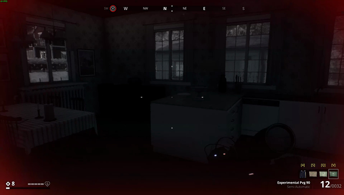
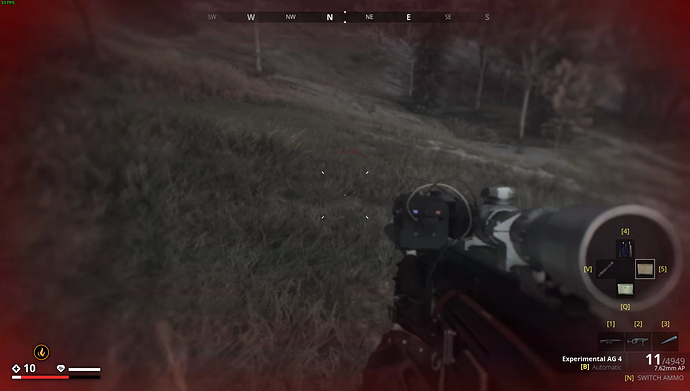
This was so from the launch of the game (March '19) up to the latest patch (June '20). For some reason, devs re-arranged the hotbar icons from line to tilted square with the last update. I have no clue as of why and personally, i don’t like the new tilted square at all.

Few before and after screenshots of it (click here to view)

Old weapon bar:

Old item bar:

New weapon and item bar:

“Stealth indicator” setting isn’t for the player stance icons but instead for the proximity arrow. Disable the stealth indicator and you won’t be getting the proximity arrow when you’re near machines.

There are two forms of inventory sorting in the game, but i guess neither of the two are good enough.

  1. You can filter your inventory by tabs, e.g only ammo or only side weapons.
  2. Every new item you pick up becomes the last item in the list. It’s a bit of doing in order to sort the list by dropping and picking up in right order but it’s doable. (I’ve done it.)

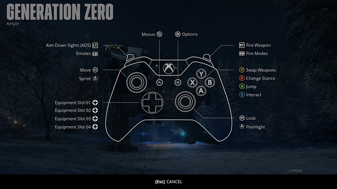
Reason behind limited quick-slots is because console controllers, which in total have 18 buttons and can’t house more. PC KBs have 104 keys, with plenty of free keys where to bind all of them.

Here’s Xbox controller mapping and where would you bind the additional quick-slot key binds? :thinking:

Of course, consoles haven’t had the June '20 update and they don’t have weapon ammo switch feature as of yet. That needs to be binded somewhere as well.

I see a lot of hatred coming out of this suggestion since every person who smashes his/hers button to switch weapon/item to change it faster in the heat of the battle, will get wrong item selected, always.

E.g: 5th quick-slot; one press = first aid kit; double press = flare. With it, people would be dying with flare in their hand, rather than healing themselves.

Dear Aesyle,

I’m glad for the quick answer for my post, but i would be more glad, if You’d read it, not just the point sentences. For example the 1. point - I like the game to keep the weapon with its attachments as You, but i don’t like to see them disassembled when they are put to the box, because i don’t know what is used, and what to recycle. At point 4. i expressed that the indicator of crawl/crouch/stand would be better to shown permanently - maybe i called it as “stealth indicator” by mistake, but by the text - if it had been read - would be clear.
And suggesting to drop all items, and then picking them up at the reverse sequence to get the newer items on the upper part of the list… is funny! :smiley: Instead of placing a few icons which would help to select different sorting methods…

It is very painful to see that almost every silly control limitation of the game stems from its console versions - because i bought the game on Steam for PC, and after 1 hours of gameplay i bought both DLCs because i saw the game great - and now at 40 hours of gameplay i’m suffering becuse only 4 equipment can be set to hotkeys…
But it doesn’t matter - it seems Systemic Reaction’s policy prefers the console players - and its our luck that Generation Zero doesn’t have a Gameboy version, because then we would be limited to 8 control buttons…

Thank You Aesyle and give my regards to the other Devs! :slight_smile:

Well, i understand your 1st suggestion as a change you like to see, rather than stating current status of the game. Hence my reply to that in that manner.

I thought that you referred to the actual in-game setting and you thought that it changes the stance icon timeout. Hence my clarification of what “stealth indicator” setting actually does.

Though, i did read your concern about the stance icon timeout. Few times, i’ve also mixed up if i’m crouching or standing and i’ve stood straight up, thus giving my position away. :grin:

The current list based inventory is relatively new (introduced in March '20 update) and devs haven’t made any significant upgrades to that as of yet. There have been few fixes but bigger QOL features aren’t still added (e.g better inventory sorting).

Yeah, consoles hold back the GZ’s potential quite a bit since devs need to work with the old and limited console hardware.
For example; quite a while ago, someone asked in the dev stream if it would be possible to add birds and other wildlife to the game to make game world more alive/natural. Devs responded to that, basically saying that consoles limit what they can or can not put into the game.

You can watch/hear devs answer at 00:15:22,
link: https://www.twitch.tv/videos/437997329?filter=archives&sort=time

Systemic Reaction doesn’t prefer console players. Instead, devs like to keep same game version on both platforms: PC and consoles. That is the reason why PC users are held back by console users. :disappointed:

If devs would split the PC and console development, PC users could enjoy a lot fuller game. Of course, console users may start complaining about game difference between platforms.

Though, latter is actually current status of the game. June '20 update brought overhauled South Coast region and new, FNIX Rising DLC for PC users. Console users didn’t get the June '20 update since optimization work for the consoles takes A LOT of time and effort.
At first, consoles should’ve had their update in July but a week ago, devs released a response that console users won’t be getting update in July either and it has been pushed even further into the future, where most likely consoles get the FNIX Rising DLC with other fixes in August.

Okay, i understand, i hope the inventory update will make it smarter than now. There is another issue what i forgot to mention, and it would be not a problem for consoles (to implement it i mean).
Its the music!
Every music is great in the game, only problem for me, that the battle music is much more louder than the peaceful music, and similarly the sound effects - the shots and explosions are very loud, while the sound of steps, and the effects of environment are quiet!
Would it be impossible in the Audio menu, to divide the volume adjust setting into Battle Music / Peace Music and Battle SFX / Non-Battle SFX ???
I see myself that to divide the SFXs would be a bigger task - but to do that with the 2 type of music is much more easier, and much more important.
I hope at least this could be implemented - because not just i would be grateful, but my neighbours and my speakers too! :smile:
Thank You! :slight_smile:

Implementing that shouldn’t be hard, though, the reason why this is so is due to the current trend in entertainment industry.

Best example would be action movies where bangs, booms and the like are much louder compared to the actors voice or background music outside of the action scenes. It is most likely done so to get the viewer’s blood pumping and give them better experience (entertainment).

Using headset saves your neighbor’s hearing. :wink: Also, headset (good ones) help to immerse yourself into the game a lot more since with proper outside sound isolation, dog barking or wee-woo going pass doesn’t interfere with the superb sounds of a game.

Sounds in GZ are very well made and if you have hardware to support surround sound (not the common 2 channel stereo), you can have far greater experience in GZ.

For example, i have 7.1 surround headset and 2.1 stereo speakers. I play GZ exclusively with my headset and surround sound since game does superb job of accurately pointing out where the sound comes from. Due to that, i can always tell from which direction and what type of machine is approaching me, well before i can even see the machine. I once did try how the game is with 2 channel stereo and while i did hear machine sounds, i wasn’t able to tell at all from which direction it came from. I was essentially “blind”.

Yes You are right, GZ’s audio is excellent, i love it very much!
At daytime i play mostly with speakers, but at night i play with headset - a great 7.1 too, like yours! :slight_smile: But that doesn’t solve the problem of the loud battle music and effects. I understand the concept of movies - but the movies are static things - You can’t change anything (except the subtitles) in a movie. But games have options menu - as GZ has too - to change a lot of things for adjusting many aspects of the game as the player desires. So the separately adjustable battle music+SFX / peace music+SFX would be a user-friendly solution (and ear-friendly) :smile: and would make the Audio menu much more useful! :slight_smile:

Yes, it would. :slightly_smiling_face:

Perhaps, one day, we’ll get more customization options for audio levels as well.
Speaking of in-game settings, what i’d like to see, is more options regarding graphics, namely the machine draw-in distance, which is hard fixed at 400m (most likely due the the consoles) :confounded: , while terrain draw distance goes roughly as far as 5km or so. I have a good PC and there would be no problem for my PC to render machines at greater distance.
I think all PC players would welcome this kind of setting, unless someone is still using old PC from 2013, with equal performance level to the consoles, where their PC can barely handle 400m machines draw-in distance (but you never know).

Though, devs are secretive about what they have in the works and until patch notes haven’t been released, your guess what comes next is as good as mine. :slightly_smiling_face:

1 Like

I fully agree. The graphics need more settings for us PC players. There is no point in bragging about a super-realistic ballistics simulation if the enemy renders in at 400 m, up to which it’s basically just point and shoot. It’s hard though without the marksman perk, but it would be really fun to be able to try out a few “impossible” shots. :slight_smile:
Hey! My PC is from 2013. Are you making fun of it? :joy:
I gave it a GTX 1080 Ti GPU, so we’re good. Smooth sailing in GZ at 1440p and 165 Hz. :grin:

Besides that, there is also the issue of scope zoom. For example, i have 6-12x scope on my 6* .50 cal since that is all i need for sniping up to 400m. Making 8-16x scope too much for such a short distance.
Due to that, i’d also like to get much further machine draw-in distance to see what 8-16x scope is truly capable of.

Well, i did specify that the 2013 PC needs to have equal level of performance to the consoles. That translates into:

  • AMD FX-8350 or Intel i7-950 CPU
  • 6 GB of DDR3 RAM
  • Radeon HD 7870 GPU

And even then, PC would be better since PC CPU core clock is much higher than console CPU core clock (4 Ghz vs 1.6 Ghz).

Despite the aquring year being the same, but since you don’t have those parts or equal performing parts in your PC, instead you have 1080 Ti in there, my statement doesn’t apply to you. :wink:
(Thinking about your GPU upgrade and due to my profession, i just got an urge to ask what is your PSU make and model (or part number) and how old it is. Though, you don’t have to answer that.:grin:)

Me too. I’ve always used the 6-12 scope, and still do. Like you say, 8x magnification is useless for short range shots. :wink:
This is in my nerd-territory! I’ve always wondered why games have so strange zoom ranges on riflescopes. It’s the same in TH:COTW. The game’s scopes have what you could call a “2 x zoom range”. E.g. 8 x 2 = 16. It’s normal for scopes to have at least a 4 x zoom range, like 3-12 or 2,5-10.
I own 3 riflescopes in real life, they’re in 3-12, 4-16 and 2,5-15. That last one has a 6 x zoom range, and it’s fantastic. I have shot deer with it at distances from 5 meters and up to 300. :slight_smile:

Right here I’m more in over my head. I bought the card from a dude who had tried mining for a few months, but he gave it up. I got the card for a little over half of it’s full price. I’ve used it for 1,5 years now with no issues. :+1:
I think the PSU make and model is Silver Power SP-S850 850W, bought in late 2013.

…will my PC explode? :laughing:

Outside of GZ, i have 0 clue about scopes. Haven’t seen one even in real life. :grin:

Reply to that (click here to read)

Silver Power…, this is the 1st time i hear this PSU brand. Though, there are so many different PSU brands out there that it’s next to impossible to know them all. What i do know, are known good brands and some brands to avoid completely.

Still, did some digging and found a review of your PSU,
link: https://bit-tech.net/reviews/tech/psus/silver-power-sp-s850-psu/1/

With you buying your Silver Power PSU in 2013 and looking the date of that review, by the time you bought your PSU, the PSU platform itself was already 5 years old. Not the best start.

From PSU review, one can read that Silver Power 850 is mid-tier PSU. Sadly, what PSU review doesn’t state, is who is the actual OEM of that PSU. Since knowing the OEM of the PSU says a lot about the PSU itself.

So, did some more digging and along the way, found out more info about Silver Power brand and eventually, the OEM of your PSU as well.


Brand history:
Silver Power brand was originally founded back in the 2004 by Tagan as their budget range PSUs. At some point (most likely around 2007 or 2008), Silver Power was acquired by RaidSonic (previously known as: Maxpoint Administration, which is also pointed out in review) where it remains to this date.
Silver Power released PSUs under it’s name for several years. Though, their latest PSU release was back in 2012, after which, no more PSUs came from under the Silver Power brand name.
My guess, sales weren’t good since PSU market is tough one to survive in.


OEM
I also found out who the OEM of your Silver Power brand PSU is. Seasonic is the one who made that PSU for Silver Power.

If you do not know who Seasonic is, then:
Seasonic is one of the oldest PSU OEMs in the world and they have been in business for over 40 years (founded in 1975).
Besides releasing PSUs under their own name, Seasonic also makes PSUs to other popular brands. To name the few: Corsair AX series, EVGA Supernova GS series, XFX TS series, NZXT Hale82 series.
Also, Seasonic hasn’t never made a bad quality PSU in their time (unless you count some noisy fans in their older models). PSU build quality wise, Seasonic is the leading PSU OEM in the world. That also reflects on the fact that Seasonic is the only PSU OEM in the world who gives more than 10 years of warranty for their PSUs (12 years for their flagship PRIME series). No other PSU OEM/brand has given more than 10 years of warranty for their PSUs. And depending on who you ask, either Seasonic or Super Flower is considered the best PSU OEM in the world.


For example, my PC is also powered by Seasonic and with their flagship PSU line as well: Seasonic PRIME 650 (80+ Titanium) [SSR-650TD] PSU (currently known as PRIME TX-650). Actually, all three desktop PCs in my household are powered by Seasonic.

With your PSU made by Seasonic, that also explains why it still keeps going since Seasonic PSUs are known to last far longer than their warranty period is.

Due to that, i don’t think that your PC would “blow up”. :slightly_smiling_face: Still, nothing lasts for forever and due the extreme age of your PSU (7 years from purchase date and 12 years for the PSU platform itself), i suggest that you replace your PSU with up-to-the-date unit.

For new PSU, i suggest any Seasonic unit in 650W range, e.g Focus GX-650, Focus PX-650, PRIME GX-650 or PRIME PX-650. If you want the best PSU money can buy, then: PRIME TX-650.

PSU warranty wise:
Focus - 10 years
PRIME - 12 years

Why 650W and not 850W? Easy. SInce your GTX 1080 Ti is 250W GPU and when you add the rest of the system to it at about 200W, the max what your PC can consume at 100% load is 450W, making 650W PSU more than enough for your PC.

I would love to have 8 or even possibly 12 item slots available simply by double or triple pressing the corresponding item slot key or button. I say button because I’m an XB1X player and our items are on the D-pad.I’ve seen similar item usage mechanics in other games and it seems to work out quite well.

This game can get hectic and you’re really limited to what you have in you’re slots when you begin a fight, because you wont have time to change anything out while fighting. Which in turn sort of limits how you will play.

For example say you want to set a trap, its a lot of pausing, unpausing, equipping items just to set things down, then reequip the items you want to use for the fight. And if you run out then you just have a blank spot in your inventory. This game has a lot of great items that lend to a host of great strategies, though often i feel very limited in what i can do at any given time.

Still throughly enjoying the game though and will continue to do so. Hope everyone is well.

Same feature request topics merged.

//Mod

I believe this is quite intentional. Having 3 slots for weapons and 4 for gear, and everything else in backpack is very realistic. Having them in your hotkey areas means they are on your person. Like the weapon in your hand, the one slung over your shoulder and your side arm. You also have some grenades, flares, health kit, and Emps stored in pouches or quick access clips. This is your 7 items.

You can’t also have land mines, gas tanks, boomboxes and car batteries hanging off your person for quick access. That would be ridiculous, and this game tries for at least a modicum of realism in this regard I believe.

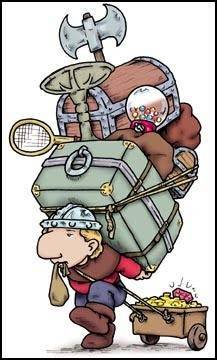
2664325_nodwick1
Do you really expect Nodwick to be able to access his new N16 without some time to take it out of the backpack he so foolishly left it in? As I see it; he can access his axe, tennis racket, font, gumball machine, gold and jewels, and whatever unknown item in the soggy pouch. See - 7 Items. Anything else and he’ll have to go through the bags and boxes which take time. Lol!

2 Likes

I’d considered that myself. Other evidence to this point would be the fact the game never pauses. But I dont know it still just seems clunky to me. Having to pull up clunky menus to swap to items in the middle off a fight is obnoxious when you’ve got 4 seekers, 5 runners, 4 hunters, 1 tank, and a bunch of ticks all up in your kool-aid.

Ive seen other games go for realism in this way though and i felt it was better implemented in a slower gameplay style. Zombii-U or also (Zombii which is now on the other consoles) was a dark souls esque rouge like. One of the best parts of playing it on the Wii U was that when you opened the bag, your character would stop and look down into it.The game would also then shift from showing yourself on the TV screen and the map on the gamepad, to showing the contents of the item bag on the game pad. Essentially forcing you to look down away from your TV screen while you went through your item bag. Making it very easy to get snuck up on by a zombie if you’re not paying attention. Just made me feel uneasy and on high alert all the time.

In gen zero it just feels way to hectic at times and frantic once it all pops off. So if you want to go the stealth route, then you better get it all right on your first few seconds and hope you can lay a decent enough trap to take out a lot of bots. Because if you haven’t switched your items back for a long up close drawn out fight then once they know where you are its on like donkey kong and goes from 0-100 in the blink of an eye. So id at least like to be able to hold enough equipment on my person to be ready for a little of both scenarios.

1 Like

Someone mentioned something similar to me years ago about another game, and his response was that he preferred games like this that had alt loadout options that he could have on hotkey. So with one loadout he could be in your face CQC, then switch to long range, and another for stealth. And I guess for you it would be demolition. The division games had something similar. It still required a little more time to switch to another loadout, but was much faster than doing everything on an equipment page where you can’t see what’s going on.

1 Like

Tip: tactical retreat. :wink:

Since you can outrun any machine and there are plenty of cover options, no-one is stopping you to leg it to the closest building, to take shelter in it, and to sort out your hotbar there.

When i 1st started out GZ and was sneaking out in the open, i always had the closest house/building marked with my waypoint, so when my position was made, i had a heading towards the closest cover.

2 Likes

Its not necessarily that im looking for a loadout system, just for the current system to feel a little smoother to match the pace of the action.

Retreat isnt always an option in the middle of nowhere. And then that just leads to very boring gameplay of hiding in cover and shooting or trying to find a defended position. Plus with the missiles and the gas bombs they can flush you out of most cover. Id just like to be able to get to my gear faster than the current system.

You have to pause, hope that the inventory was the last tab selected otherwise its a bumper press or two. Then you have to get to the equipment or weapons sub-tab then you have to assign the item to a slot or equip it. Then back out of the menu, and THEN you can use said item or gun. Like, thats a lot to do and react to given that the menus aren’t always on the same page when you pull them up. So its never the same button press combo to get you where you want. Eliminating the usefulness of muscle memory.

Id like to see things like holding down the menu button (select on console) bringing you directly to the items tab or the map tab. Double pressing for another option. Id like to see double taps for a few more items even if we have to unlock them one at a time via clothing or equipment upgrades. Or even just setting priorities for items so that when i run a slot empty, another item will automatically take its place.

Yeah i know this seems like nitpicking to someone whos played the game for a long time. But as someone whos played dozens of games just like this, i can see great potential in it and thats what keeps me coming back.