(Before I start I wanna say of-course the top priority should always be bug fixes and QoL, I dont consider this a “must-need” or high priority suggestion in the slightest. Just an immersive change idea I’ve had).
Hi! I’d like to present some ideas, examples and descriptions for some changes I think could be made on the menus we use inside of Generation Zero. For a while now I’ve thought the blocky font “future” looking menu system we’ve gotten used to doesn’t fit the games aesthetic and for new players may even be a little too much. These changes involve the player relying on physical forms of menus reminiscent of "The Forest"s system and I believe that a change like this could really assist the immersion that our current menus prevent.
As it stands the menu uses 10 sections with some e.g. “Log” having numerable subsections with a LOT of text.
I’m going to go over all menu sections and sub-sections 1-by-1 deducing ways I think that these physical changes could assist with immersion and make using them easier.
My apologies for the rather butched use of pngs and not professional level editing, I tried my best but want most of this to be up-to interpretation.
Grouping 1 - Skills, Schematics, Team, and Challenges
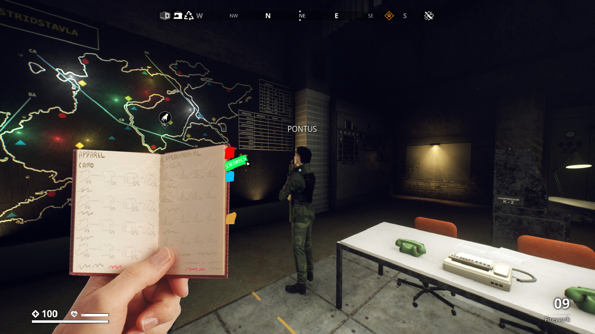
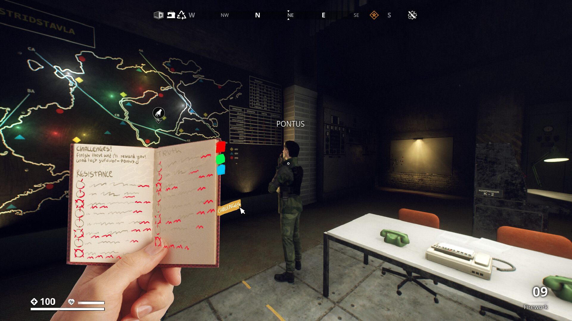
My initial idea for this grouping is receiving a booklet from our friend Pontus, given that they’re a soldier I thought that them introducing you to skills to improve your combat, your team to showcase individuals skills, schematics for things you can create to aid you, and challenges from themselves, puts this immersion/advancement/reward theme in one place. It has a hand-made, dirty, survivalist vibe so it that feels personal to you and your own advancements. In order to view your tabs you would click on page separators on the right hand side of the booklet, hovering over them would pull it out to see what the title is. Places that important information would be e.g. hints/rewards/locations would be shown in a highlighted colour (I have used red to demonstrate this).
Skills -
The skills side of the booklet is a simple 6 skill top to bottom placement spanning the 4 pages. Hovering over the skills individually opens a pop (OR, unfortunately I didnt make an example for this, pulls out another shred of paper from between the pages) showcasing the information/changes aswell as how many points you’ve spent on that skill. The amount of skill points would be at the top right of the first page, aswell as how far you are in terms of leveling up. There’s not much different here to note other than the way skills-paths have been separated page-for-page.

Schematics -
The organization of the schematics has been changed to have a type of schematic per page, and instead of placing them downwards separated by the augmentation, the augmentation is its own subheading with the ammo type/apparel/item beneath it. I think specifically having these subheadings prevents the need for hovering over them and checking, which may be confusing. The grade of the item in question is shown beneath it. This is different for crafting items/dlc items however, which would be connected based on what area of the game they directly effect for e.g. sound or explosives. It also wouldn’t require you to have obtained the item beforehand as I think that creates a need to grind out for items you dont want before getting the item you’re looking for.
Team -
The team menu is very different from the original (and hard to present), I imagine that based on the number of players you have in a world it would slowly fill the left hand page in an organized format. For example, 2 would be pictured at the left top and the right bottom, 3 players would be pictured at the bottom left, right middle, and top left etc. until the full squad example shown. Above the players is their name and level and to the left of them is their specifications. I wasnt sure how to show this but the characters individual models would be shown on the page with a “toon” or “drawn” filter over them to make them look like hand-drawn pictures, suiting the style of the book.
ADDITIONALLY, on the right page is a section dedicated to survivors that you encounter, including a picture and any vital/fun information about them as-well as their location.

Challenges -
The challenges are shown to be given by Pontus personally and present themselves as fun side-quests for non-essential rewards. Types of challenges e.g. Survivor/Truth, are separated by page, while the relevant challenges are presented beneath them, with relevant information + the reward(s) you recieve from them. Instead of using a space consuming line system I chose to show the progression of the challenge with line markers within the circles, when a line has been crossed by your progression, the corresponding highlighted reward is either rubbed-out or crossed out, showing you’ve recieved the item. DLC related challenges could be given to you directly from the NPCs who are involved with it, for example Alpine Unrest challenges are added to the booklet with personalized handwriting from Elsa.
Final Notes -
I really hope the botched look for these examples doesn’t discourage from anyone expanding on this idea, it may be far fetched and I’m not the best at presenting it but I truly think this is a really fun/immersive idea that could be given a look at. This IS Part 1 and I plan to look at the other sections of the menu individually. Thankyou for your time, I hope I haven’t made too many typos or missed information.