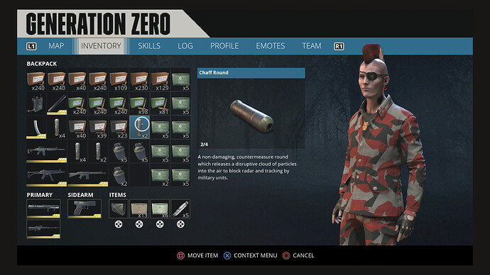
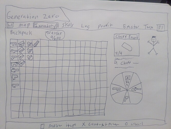
I wish they would bring back that inventory screen, seeing everything at once is nice
It has advantages and disadvantages.
I never experienced this grid based inventory.
It looks interesting, but it’s also some kind of limited.
Keep in mind that at this time there were many many less items and weapons than now in the game. With this old grid you wouldn’t have the space/enough slots to carry all that that you can carry now.
Weight played no role. Just the slots. It remembers me of a Resident Evil (biohazard).
But with some changes I could imagine to use it for testing. Attachments shouldn’t use an own slot, if attached to a weapon. Ressources still should have an own tab like another bag besides the backpack.
And ammo should be stackable in greater amounts.
It also had some rather annoying bugs. Like items sometimes disappearing to a different “layer” of the inventory, rendering them unusable… Glad that one’s gone.
But the look had it’s charm, I agree 
not exactly that inventory screen, a updated version of that one, stretch out the boxes, allow more than 240 fmj ammo in one spot etc, shrink the description screen and put more slots, etc etc etc
Even more slots wouldn’t make sense in a limited grid based inventory, in my opinion.
The question is just: what’s the best limitation for an inventory for a game like Generation Zero?
I like the grid based one, but its limitation is based on the number of items, while the row based inventory that we have now is based on a limitation of total weight. It’s more flexible now and as we may need or may find many different items or weapons it’s currently the better solution.
If we wouldn’t need a slot for each pile of ammo and each attachment, the grid based one could offer a better overview.
So if there would be just one pile of each ammo type and everything that is attached to a weapon wouldn’t need a slot (including the currently used ammo) it would have more space for other stuff.
But in the end: if the grid is full, it’s full. If you’ll find something you want to pick up, you’ll have to drop a whole slot… A weapon, all med kits, all rounds of one ammo type… On the other hand, with the current weight based inventory, you just have to drop a few items of a kind to get enough space to pick up something else.
But finally: tastes are different.
I liked that inventory screen but being able to have up to 8 weapons equipped at once is pretty nice too
the weapon wheel could be added in that empty space next to his head, there is plenty of room to squeeze updated stuff in there, there is space under sidearm, 4 spaces under items, space is there
You don’t even need space for the weapon-wheel. Just like now it could be an overlay which just appears on selection of an item/weapon for placing it on a slot.
Nevertheless it’s wasting time to talk about that as a feature request, as the devs surely won’t make a 180° turn again.
Fortunately this topic is placed in community content. General discussion would also be fine.
Oh, you are right, I remove post from here and move to the correct forum.
the game devs listen, they just pretend not to see/read everything, toggle the option would be nice, if you like the old one great, if you like the new one great, the toggle option 2 switch between either one would be nice
Indeed, but that’s not as easy, because these two systems are completly different.
I could imagine to have this option before starting a new game (classic/modern inventory) , but no toggle.
Sorry, thanks for the effort, but there are some things you shouldn’t ignore.
-
Either weight or space on the grid should limit what you can carry. Not both.
-
The grid is way to large. The original one has a good size. The inventory should give you access to all of your items and weapons as fast as possible. To select the item in the lower right corner or even somewhere in the center you need a lot button presses.
it’s difficult to count all the attachments, guns, etc without, scrolling Up & Down, Up & Down, Up & Down  the list
You confuse inventory and plundra now.
But you’re right. Attachments that are attached to a weapon should be bound to the weapon and not be listed any more.
By this you would just see the attachments that are not attached, so either not used or not needed.
On the other hand… Recycle them, throw them away… You don’t need them all. Or you could use filters to reduce the list of visible weapons or attachments to just those you are looking for.
Yeah, but the scenario is: you’re a teenager stuck in an dangerous world who found an attachment for a weapon, and probably would not know on what weapon it goes. So they have collect and do like trial and error. And learn. 
Yes… But not dozens of them… 
Why not? That’s what gives you the closest feel of what the character is experiencing. All the QoL stuff is just diminishing all that. At the same time people are asking to go back to how the game once felt (this topic).
It is blowing my mind. 
Sorry, I can’t follow any more. What are we discussing about now?
It feels like you are advertising for something like infinite space 

