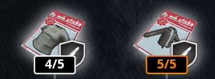
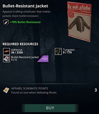
Hi, in the schematic menu the schenatic show how much % will the next upgrade add to the gear and i think it could be changed a bit.
1. Once you get the item on max LVL, it would no longer show required resources because it cant be upgraded so its kinda confusing…
2. When i have one item 4/5 and one 5/5 it shows +10% on both items, so my suggestion is that it could show with white text how much % it currently have and then with green +% how much will the upgrade add.

