I know how little the community usually influences the development of a game, but I’ll post this anyways. I’m a newbie and may be wrong about some things, so forgive me if I get anything wrong. Also sorry if these have been discussed in the past. But I have a bunch of things to say, so I’ll group them together here.
Coming from The Divison 2, I feel there’s features that should obviously exist to improve the inventory experience in the game.
-
Comparing weapons
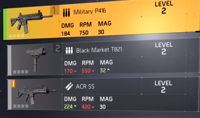
In The Division the stats of every weapon are always compared to your equipped weapon, so you always know if it’s better or worse.
I know GZ has a different weapon system, and two primary weapon slots, but still, being able to compare individual aspects of the weapons in any way would, I believe, be a very welcome improvement. This point also leads into… -
Show us the numbers
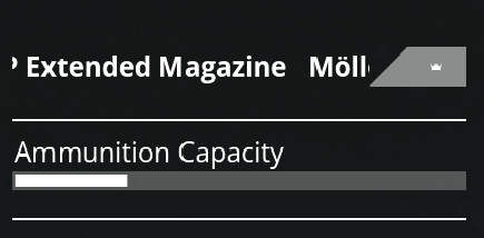
The progress bars are a pointless obfuscation. E.g. upgrading my pistols magazine, you see this:

What’s the actual size of the mag? Is it better or worse than what I have now? Seeing actual values would make the experience so much better, we love comparing numbers. It would be especially useful combined with… -
Mark as junk, pick up as junk, recycle all junk
Being able to pick up weak weapons as junk would, I believe, be a great addition, especially since there’s recycling in the game, much like The Division’s deconstrution. You’d be able to pick up weak weapons as junk and forget about them, recycling them when you get to a safehouse. Now I have to browse the inventory and remember which weapons I intended to recycle. -
Double click to equip a weapon
Even though The Division only has one primary weapon slot, you somehow don’t care, because swapping weapons is so fast. Maybe I just missed the shortcut to quickly equip a weapon, but right now assigning weapons to a slot by clicking around feels really slow, not to mention I can’t see what weapon I’m replacing. I’m equipping a shotgun… so what’s in the first slot again? I need to hover the bottom slot to see what’s in the first slot. Maybe my personal pet peeve, but I always double check what weapon I’m replacing, and it adds to how slot the equipping feels. -
Item wheel
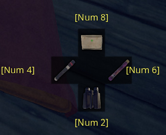
Why are the items arranged in a wheel if there’s no shortcut to equip them directionally?

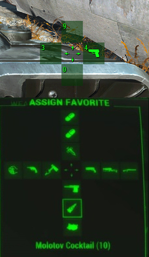
I binded them to my NumPad, which is better than the number row, but still not ideal. Let’s take fallout 4. By pressing F+D you equip the pistol.
And you can have more than one level, solving the keybindings for items. Press F+D+D to select the second item on the right, F+A+A+A to select the third on the left, etc. Unless it’s intentional that we can only have four items equipped of course. (Which then really frustrates me, because there’s like 4 types of medpacks.)
If you insist on the current system, can we at the very least use the entire number row, like in Escape from Tarkov?
I love the game, but I feel the inventory experience could be so much better.
I reference other games, but I admit I haven’t played any other Avalanche Studios Group games, and I’d love to know if the inventory in any of the Hunter games for example are better.
Thanks for reading. I’ll be happy to correct my opinion on any of these things, should I be wrong about my assumptions.


