Hello everyone and Avalanche Studios,
I want to sum up my experience with the new inventory system: the issues I have encountered, the solutions I have thought of, and the general feedback of the system as a whole.
The new inventory system does a great job of solving the issue with not having enough inventory space. Changing from a tile based system to weight was a great decision, well done. The inventory is more organized and easy to navigate, though it is not without its problems.
-
The new inventory requires more time to navigate making a simple thing like glancing at the inventory a why bother. No more can a player make a quick change of ammo type, medical item, throw-able, and/or place-able item in combat. All solutions below work together to solve this problem.
-
The organized lists help players find what they are looking for, but this system greatly restricts how much of the inventory the player can see. There is too much scrolling involved in the current process. Paired with that, the constantly loading icons whenever the inventory scrolls is annoying, confusing, and distracting. Instead of lists perhaps use a grid of item icons getting rid of item names unless the item is selected. Think of the grid like Windows File Explorer, just a grid of items that organize themselves based on name or type or whatever. This grid can further be filtered by the already implemented categories. Please allow the rebinding of the keys for switching categories, ‘Z’ and ‘C’ work, however, there are far better keys I could use that allow for faster inventory navigation.
-
The addition of the ‘E’ key to assign an item to a slot or equip a weapon to a certain slot is great, however, please allow a key press of the slot number to assign an item to that slot. For example, when a player presses ‘5’ on a bandage it is assigned to slot 5.
-
With the redesign of the inventory, ammo switching is no longer viable mid-combat. As mentioned in this post: New Inventory system complications, there should be a wheel implementation for changing ammo types for the currently equipped weapon. The best way to do this would be a wheel that appears around the crosshair when ‘R’ is held down and a simple mouse direction to indicate which ammo type to use that the player currently has in their inventory. If the ammo type does not exist in the player’s inventory then it should not appear as an option in the ammo wheel.
-
Items are no longer easy to get to and thus swapping items out mid-combat to adapt to the situation can no longer be done. It would be great if the inventory remembered what category the player was filtering by when last in the inventory allowing for quick navigation of items and equipping them. For example, if the last time the player was in the inventory they were looking under primary weapons the inventory would open up under primary weapons.
Overall, the change to the inventory system is great and much appreciated. A couple tweaks and additions will really polish out this new system into something usable and useful for the game.
To anyone that agrees with the issues I pointed out go ahead and like the post so that Avalanche sees it. If you have other suggestions/solutions for the system please comment them below.
~ Vatruvius
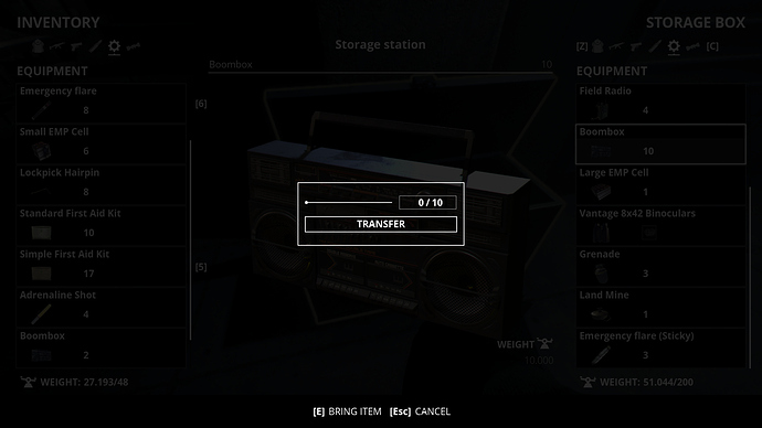
Edit: I would like to add another issue I have come across. When it comes to transferring/dropping items, moving 0 items should not be an option on the slider as seen in the picture below.
