I will be bringing another topic for QoL suggestions as JoJo the meme dealer sparked more interest in how we all somewhat want the same things in our own ways to be improved upon. All that this shows is that these areas specifically need attention from all of us, as he asked us all separately and we still aligned in vision. His video showing this alignment -
It’s actually interesting to take note from and I got featured, so that’s epic!

Inventory as it is now is not very easy to use in combat situations and slow when quickly trying to do things. I’ll point also to two topics that also mention those things that somewhat aligned in the video -
What specifically I wanted to add to all of this is more specific ways of making the inventory flow better.
 Suggestion 1. Inventory flow / Options flow
- Request Make the inventory be completely navigateble with keys and key presses. Create an option between mouse users and keyboard users for PC to combine the most optimal flow. In addition apply this to options and other list items to go through things with keypresses.
- Actions WASD are used to navigate in inventories to then use combinations of E or R to select items or in case of options, Enter to apply. In options, as they’re a vertical list, WS to move up and down the list, A D to select an option that changes by the horizontal arrows, then enter to apply changes.
In addition to Inventory flow, I want to bring a bit of that grid system in the inventory without changing this new inventory. There are pros and cons from when we first had the grid system and now when we have a weight system.
 Suggestion 2. Inventory items on Screen
-
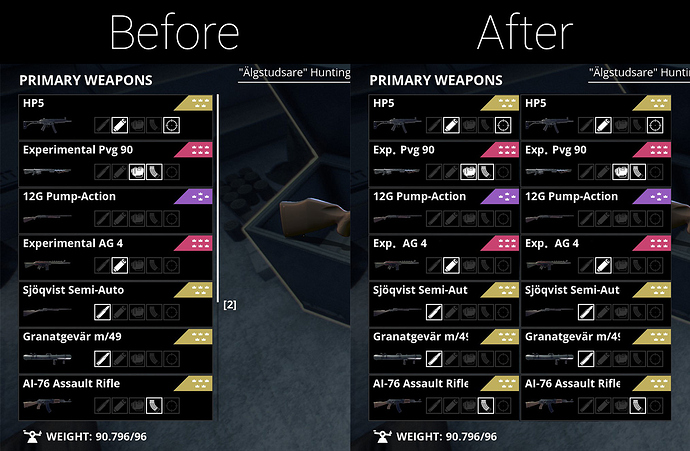
Request Make the inventory have two cells Horizontally of items show by shortening names and using static images for items to reduce loading time for these items when scrolling. In combat specifically, you’re trying to be quick and even are precise with your presses in this clunky system, but it still takes time to load the images which still makes me wait and get damaged as I try to select the items I need.
This still ends up pointing to This QoL topic I made that mentions the 2nd point. - Actions Player enters inventory and sees 2-3 cells of items horizontally to see more items on-screen, reducing the necessity to scroll vertically down and have to wait for items to load in. The player ‘could’ choose in options to select whether they prefer only icons or only names of items with shortenings. Ammo in this case would have distinct icons to show the different types. The player uses regular mouse scrolling and clicking or Keyboard to AD or ZC around the top strip of the main categories, then S (W would go above, which would end up going to the the Map/Skill/Inv selection), so when the player navigates down with S, they can hold S to imitate a scroll with a mouse wheel, but with keyboard presses. This can make it that even if there are still many items to scroll through vertically or horizontally, the player can hold with a small acceleration to holding WASD buttons around the 2x10 (example) grid to go through things quickly.
This point is just to please let us see more on-screen choice and navigate quicker through with keyboards to take the best out of the grid system and weight system and combine in something better for use. Overall what I feel is needed is this flow for using mouse or keyboard on PC to have the best of both worlds in how the player navigates inventories. Some won’t have to rely on their clicking accuracy in inventory, but rather memory of specifically what keys in what order they pressed to get their usual standard medkits, if the automatic refilling in hotbar won’t be a thing 
Example

