Feedback request - Sorting items in the inventory

Hi Francesco! :wave:

I think that most players would be happy even if the sort order was locked to alphabetical as long as it was consistent. That said, here is my feature wishlist for sorting.

Filters should be selectable in a drop-down style menu in the inventory screen. Storage Boxes and Recycling Stations should have an additional menu to sort storage contents. Perhaps controller users could click the respective thumbsticks to cycle through the lists.

Each tab of inventory and storage should remember its own filter, even between game sessions. This depreciates the need to fret too much over which filter is default.

If two or more items are tied when selecting a new filter, this should be resolved by respecting the previous filter. This allows players to achieve a more granular sort order which better suits them.

The set order of the “Equipped” tab is fine. In fact, static placement of each assignable slot would be nice. (i.e. First primary weapon always appears in the first slot, empty if not equipped. Sidearm always appears in the third slot, empty if not equipped. Etc.) The UI can support 7 inventory slots before scrolling is need and there are 7 assignable item slots.

Every tab should include:

  • Alphabetical
  • Chronological (This one is tricky. It might be more practical to add new items to the top of the list as they are acquired after the filter is selected.)
    One of these should probably be the default sort order for every tab. This maintains consistency for new players.
  • Weight

The “All” tab could also include:

  • Type (Concatenate every other tab in order.)
  • Quality

The “Primary Weapons” tab could also include:

  • Type (Shotgun, Rifle, Heavy Weapon, etc.)
  • Quality

The “Sidearms” tab could also include:

  • Type (Handgun, Melee)
  • Quality

The “Ammo” tab could also include:

  • Type (HP, FMJ, AP, etc.)
  • Quantity
    Note: Caliber of ammo is covered by Alphabetical.

The “Equipment” tab could also include:

  • Type (Explosive, Distraction, Healing, etc.)
  • Quantity

The “Attachments” tab could also include:

  • Type (Barrel, Magazine, Scope, etc.)
  • Quality

The “Resources” tab could also include:

  • Quantity

On a tangent, it could also be nice to filter clothing by the type of bonus that it grants. Those extra percentage points of gas resistance or jump boost can come in handy once in a while!

I hope this feedback is useful and I look forward to seeing your implementation! :+1:

1 Like

I think that the most important thing for me would be to place similar things close to eachother. So if I have multiples of the same weapon, they’ll be right next to eachother, so I’ll be immediately able to tell if I should dispose of/recycle/give a weapon away or keep it.

Weapons of similar types should also be grouped together, so health pickups are close to health pickups etc.

Ï’d also like the ability to rename weapons. So, perhaps if I have multiple AG4’s set up for different purposes, I’ll be able to name them “Marksman”, “Sneaky”, “Hipfire monster” or “Give to Sven next time we play”.

As for filters, I’d like to be able to choose whether to display “vanilla” weapons (not customised), “personal” weapons or both. Yet again, to make it easy to tell what I can get rid of.

Hi there, im a long time player of GenZ and played since launch. Personally i feel that you should either drastically increase the storage space, either that or make the storage container have unlimited space, its frustrating that the storage space is so limited. As for sorting items, it would be wonderful if ammo was sorted out by weapon type, so maybe AR and sniper ammo togeather, rocket launcher and Shotgun ammo in another tab and Handgun and SMG ammo in another. Its pretty annoying to sif through different ammo types in the current layout of the storage.

Here, i wonder, how on earth did you play GZ in the early days, without any Plundra what-so-ever and with half the carry capacity as it is now? :thinking:

3 Likes

In the early days, there were no experimental weapons or crafting stuff. But yeah, my inventory consisted pretty much exclusively of guns and ammo.

In the early days, there was no weight limit to your inventory. The inventory layout was grid based like in Resident Evil 4 or S.T.A.L.K.E.R Shadow of Chernobyl. So you wouldnt become
overencumbered, whatever you cant fit in your bag, too bad. But now that GZ uses a weight limit styled inventory, sure you can pick up as much as you please. But if you pick up too much you stop moving, which is fine, but it seems abit rediculous that the storge box has a limit, and even if you want to put a limit, why is the limit so small? 200? So yes i stand firm that the storage should be fixed, either greatly increased in size or made unlimited. I can assure you that im not the only person who feels this way, just check the GZ subreddit.

What would be really nice in addition to what people have said already is a search field. If you have a large inventory, it would make it faster to find something if you can type it out. I’m using a PC. Not sure how well this would play out on consoles.

Hi Francesco,
my name is Martin and to answer your question about the sorting feature I would like to suggest that the default filter be by “type” it would be especially useful going through the ammo and misc. item (ex: gas tanks) category. Other suggestion would be by “weight” and "alphabetically. I’m playing the game on PS4 (if it’s of use to know).

Thank you for taking the time to read and have a good day.

Just show more on a single page. I’m playing aat 1440 on PC and can only see 7 items at once?

If you moved the icon and the quantity to the right of the text, and shrunk the middle-of-screen-image (which is much much bigger than it needs to be) you could fit another 3-4 items in the list, and the layout would be “columnar” - text, then icon, then quantity. That alone would be a huge improvement both in terms of readability and in terms of needing to scroll less. Still not amazing - I’m used to being able to see 20 or so items at once in many games (yes, even games that also have to work with a console UI). But 10 is better than 7!

Yeah that’s why the grid system was better, no scrolling and no lag

The inventory have some Quirks first the lack or older, also that item can have shifted around when your going to switch something else out Later <.<
The only order there is, is Quality by Stars on the items (Weapons and Attachments)
With 6 Stars on top and 0 star at the bottom.

Which is alright, But!
Also means it is likely to be the first to get thrown away by mistake

My friend at 2 Times had thrown a weapon and it’s attachments away while looting or dropping items <.<;
She lost an Experimental “Klauke 17” that i gave her (I had 3 when i had acquired 4 Experimental…)
and we were not able to find it again when she discovered… -.-

Second time (Last night) it was an Epic (4 stars) PvG, which i found in a bag along with collectable weapons of the location she throw away as she had found better.
I asked her why she dropped her PvG and she was like “what?, where is my Sniper!”

I’m not sure why this happens, but it might be due to the mouse cursor moving around invisible when you look around <.<;
instead of it being either where it last were or centered in the Screen each time the cursor is put into use again.


The “EQUIPPED” Tab

I have not really have much use of the “Equipped” tab in the inventory
as I always have to go to any of the other tabs for Weapons/side arms, Tools
where “E” is to assign it a slot to switch items/weapons
Also why is it that in the Equipped tab, “E” to unequip the item in the slot?
(that could have been another key on PC)

Also switching weapons mid combat is rather hectic! >.<
Games like S.T.A.K.E.R. & and “that gearbox game”. you could quickly drag n’ drop it into the weapon slot(s) and you switched it before closing the inventory
while still see part of what is going on in front of you, in Generation Zero you only have sound to go what is going while switch an item or weapon…

Why is “E” in the Equipped tab not “Switch item in slot” instead?
which would make the item/weapon switching so much faster and less hectic due to less time spend switching.

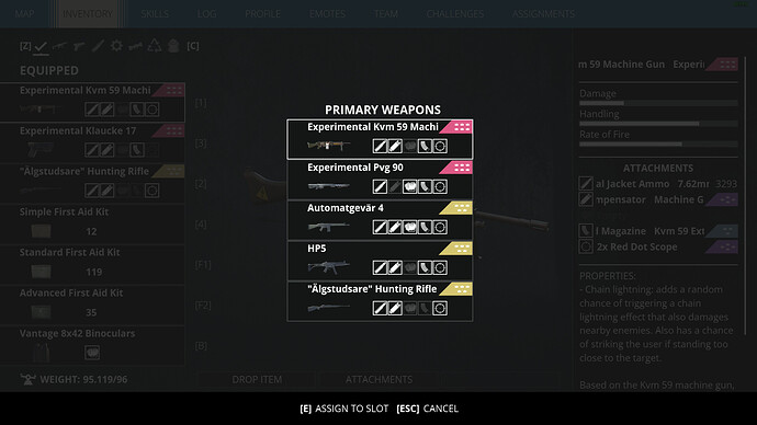
Here is an Muck-up to visualize:


Favorites

I have though about the option make items “Favorites”?
which will put them at the very top, but also disable dropping the Weapon or throw them into containers or robot wreaks, But still allow you to put it in your stash of course!

Same with Clothing and Cosmetics, at the top and selected color as #1
Similar with Sewing machine, but currently equipped cloth should probably at the very top
so it is automatically selected when switching the tabs for the sewing machine.


Consumables & Ammo

Some items, like Consumables should probably be grouped together if they are similar in function:

Consumables Group Order example

Small Battery pack
Medium Battery Pack
Large Battery Pack
Car Battery

Fireworks
Flares
Sticky Flares

Simple Health Kit
Basic Health Kit
Advanced Health Kit
Paramedic Response Pack
Ammo Box (It’s Similar to the “Paramedic Pack”)

Grenade
Smoke Grenade
Landmine

Small Fuel Tank
Medium Fuel Tank
Large Fuel Tank
Gasoline Tank
Compressed Air Tank
Poisoned Gas Tank

Either with weakest above or strongest above, but with peaceable once below them all.

For Ammo probably something like this for the variants of each ammo caliber:

Hollow point
Soft Point
Full Metal Jacket
Armor Piercing
Smoke
Emp


Schematics

Schematics probably should be Alphabetical
then Quality so each type is grouped together (Golden on top and “Dirty” at the bottom)

But for Sewing, There Probably should also have an option to craft the maximum available schematic with 1 click, if you have all the previous tiers ofcourse.

3 Likes

The default inventory is really bad as it is, specially because the looting element takes a big role in the game. Going to the Safehouse to store or recycle items is always a pain because:
A: they can’t be alphabetically sorted so it’s hard to know how many of the same item I have so I can recycle the other ones
B: Everytime I store or recycle a item the list shuffles so I have to scroll up and down again to find duplicates
C: Not being able to sort by weight it takes too long to check what’s cluttering my inventory.

Perhaps a button to store everything that doesn’t have a tag like “Favorite”?

said so

Default sorting for Recycling station: NAME
Default sorting for Storage Station: TYPE (Shotgun, Machinegun, Sniper, Medkit, Trowable, etc)
Default for Inventory (Equip) Weapons Screen: QUALITY
Default for Inventory (Equip) Items Screen: TYPE

The items inventory could have a sorting button to toggle between:

Heal first
Hack first (EMP, etc)
Explosives
Support (Field Radio, etc)
Accessories (Binoculars?)

and a BIG thanks for the devs for the effort of making the game always better

1 Like

Now that you have had a while to work on the item sorting options (is that still ongoing???) perhaps I could also suggest an option for sorting missions by time completed, alphabetically or by region.
I found the mission logging horribly confusing and would often run around looking for mission objectives after a mission had been completed because the completion message was too subtle and easy to miss.

I surely hope the devs bring the sorting with the coming update.

Even then I think the mission shouldn’t just “unfollow”. I find it annoying to scroll through the finished missions to find the last finished one.

1 Like

A smart filter as default would be useful that matches previous selected item compability in inventory when switching between categories. This would give faster overview of what you have and decide if use, drop or save to recycle item later.

I.e. show compatible items that is specific to a weapon type first in the list and then the rest in default sorting order (item levels then alphabetically).

User Inventory action:
Inventory default sorting list.

  1. Select AG-5 and switch to Attachments shows type unique items (clips), then compatible items (silencer, barrel, scopes for assault weapon type), then the rest of Attachments sorted as usual. Switch to Ammo and shows compatible items first and so on.
  2. Select assault silencer Attachment item and switch to Weapon shows compatible weapon types first.

Items with no compatibilty and don’t require switching category should be sorted by object type as default. That is all items like Health, Explosive, Lure etc. Only these items don’t sort by switching category (see comment at the end about this).

A highlight of compatible items first in the list would probably be needed to give visual feedback of that the list is sorted by previous selected item.

User Plundra action:
Here you have two Inventory lists and selecting an item I always want to see what I have in the other Inventory. Sorting and cleaning severely limited storage space is painstaking wasting time today.

Selecting an item in one Inventory should automatically sorts and highlights related items first in the other Inventory. This single implementation using Plundra would raise quality of life saving time to scrolling in lists and get back to next mission faster where the fun is.

As @SR_Carni pointed out the “Total weight of all units of an item, descending (heaviest first)” is another much needed sort order imposed by the limited storage that just takes time from gameplay.

In Call of the Wild there is a button to filter and show compatible items. I don’t think that way is optimal in Generation Zero where you have to evaluate and load/switch items in action.

@Francesco take a moment and raise the question if the items that have compatibility dependencies (weapons, ammo, attachments) really belongs in Plundra at all. A separate weapon locker with also 200kg storage would probably make more sense. User Inventory have three distinct category types where Materials already have a separate storage in Recycling Station, so why not a separate storage for all things related to weapons?

Is there any reason why weapons and attachments can’t also be stacked in the list like ammo and consumables?

I don’t know if Francesco is still with the team, but I’m wondering if maybe a quick fix for this would be to include the option in the settings in the next update, until it can be included in the inventory UI.

So, to summarize from what others have written above, you’d go into Settings > Game, then select options for “Inventory Sorting”:

  • Default “Items ordered with most recent items first”
  • Alphabetical “Items are organized based on name, and then quality”
  • Total weight of all units of an item (Heaviest first)

Also, as incendito said earlier, is it possible to stack weapons and attachments in the inventory? Maybe this can be an option as well.

4 Likes

Thanks for adding this, but there is no quality sorting. Only filters that display weapons or attachments of a specific quality… and to be honest it sux.
The same goes for the attachments and “type” filter.

We need an option to sort in both Quality and Type.

On the first inventory screen sorting is unnecessary. We have there only 8 equipped items and it should be from 1 to 8.

3 Likes

I think this new inventory filter implementation is an excellent base to enhance in future updates.

I would like to add just one more request:
Add a “Reset to Default” or “Activate/Deactivate” button. It will make sense since filter have ‘exclude’ function. This will make it easy for support when players who forgot about using the filter and think all ‘excluded’ are missing :wink:

2 Likes

This is definitely a step in the right direction, but it needs work for sure.

I wish I could sort by rarity like before the update, but with everything in alphabetical order. That’d be perfect for me.